FORVA is my health and fitness app project, currently in development. The design preview brings training, nutrition, recovery and progress into one experience. This article looks closely at the Today screen: a useful place to see how a broad product idea can become a more focused interface.
A broad product needs a clear starting point
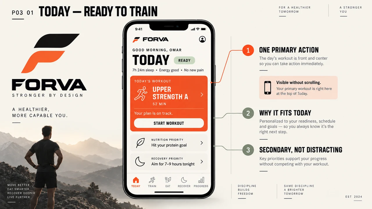
The design board shows five navigation areas: Today, Train, Eat, Recover and Progress. Each represents a different part of the product. Putting all of their detail on the first screen would make it difficult to know where to begin.
Today acts as the entry point. The featured workout occupies the strongest visual position, with a concise title, duration and start action. A person can identify the main activity before exploring the rest of the app. This is a design direction shown in the board, rather than a claim about a released feature.
Use visual emphasis to explain priority
The orange workout card has more contrast than the supporting cards below it. Its button sits inside the same block, so the activity and the action remain visually connected. The rest of the screen uses softer surfaces and smaller text.
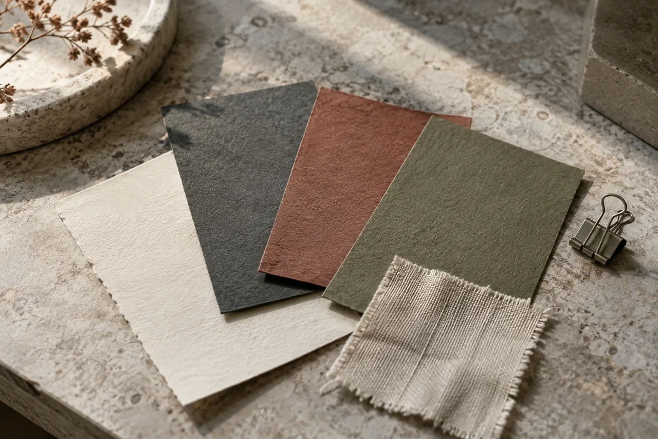
Color is doing a practical job here: directing attention. A strong accent loses that job when every element uses it. This preview is a useful example of how a limited palette and a few deliberate differences in scale can organise a busy product idea.
Keep supporting priorities close, but secondary
Nutrition and recovery appear below the workout, each with a short priority. The page acknowledges that fitness involves more than the training session, while leaving the main action easy to find. The readiness summary above the card provides another layer of context.
The values and recommendations visible in the board are part of a design concept. They do not demonstrate a working personalisation system or health outcomes. The interaction and the information behind it would both need testing before a public release.
What a design preview makes easier to discuss
A board like this gives a client something specific to review: the first screen, the action that gets emphasis, the navigation structure and the role of supporting content. It turns a broad request for a fitness app into concrete decisions.
The next useful step is an interactive prototype that covers more than the ideal state. What happens on a rest day, when information is missing, or when someone returns after a break? Those questions define meaningful product work without adding features just to fill a screen.
Common questions
Can I use FORVA now?
The portfolio currently shows a design preview. FORVA remains in development and is not presented here as a released app.
Does the board prove the app’s recommendations work?
No. It illustrates the interface direction, not validated recommendations or measured health results.