Ma’ab is my prayer and reflection app, currently in development. Its screens explore a small but important question: how can a digital companion help someone return to a routine without making that routine feel like another performance dashboard? This walkthrough looks at the current interface, rather than presenting an app-store launch or user results.
Start with the next prayer, not every feature
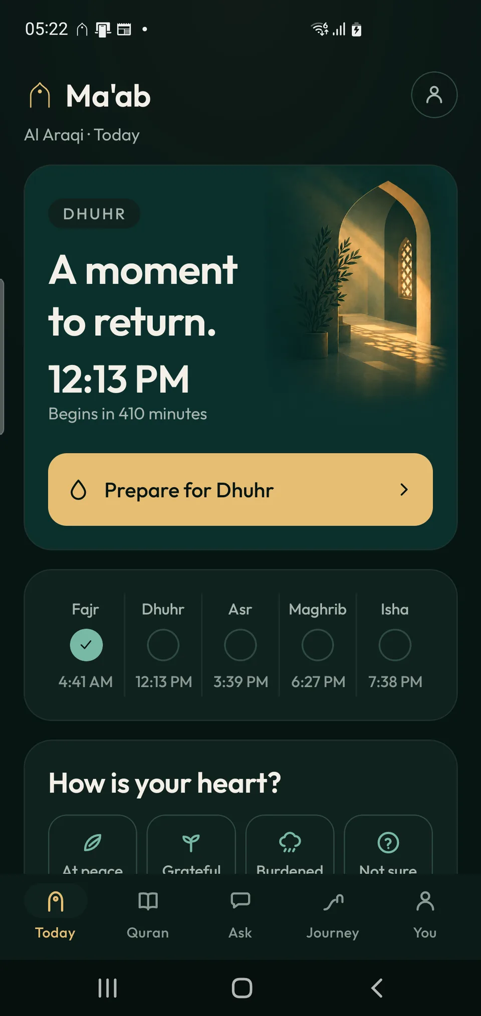
The Today screen puts the next prayer in a large card, with its time and a clear preparation button. A smaller row gives the wider day some context. The visual hierarchy is simple: understand what is coming next, then choose a next step.
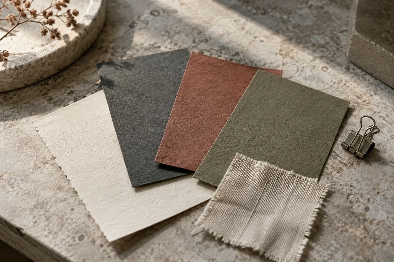
Below that practical information, a short emotional check-in changes the tone of the screen. The design makes room for how a person arrives at the routine, not only whether they have completed it. Deep green surfaces, warm yellow actions and generous spacing hold these different pieces together.
Make preparation a manageable choice
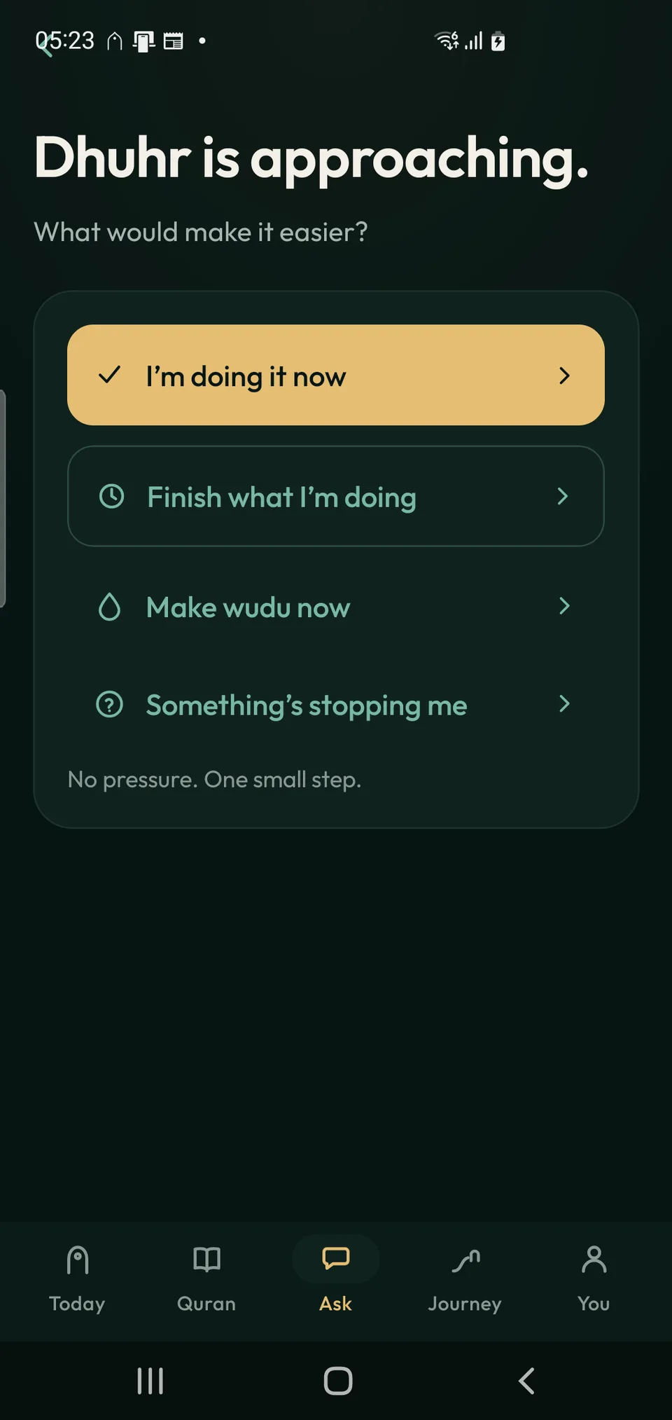
The preparation screen asks what would make prayer easier. Its options acknowledge different situations: beginning now, finishing the current task, making wudu, or naming something that is getting in the way. A single highlighted action gives the page direction while keeping the alternatives visible.
For product design, this is a useful pattern beyond this particular app. When a person hesitates, another reminder may not answer their problem. A short set of relevant next steps can make a workflow easier to understand. The important test is whether those choices match real situations.
How to test a focused app journey before building more features ↗
Let reflection follow the action
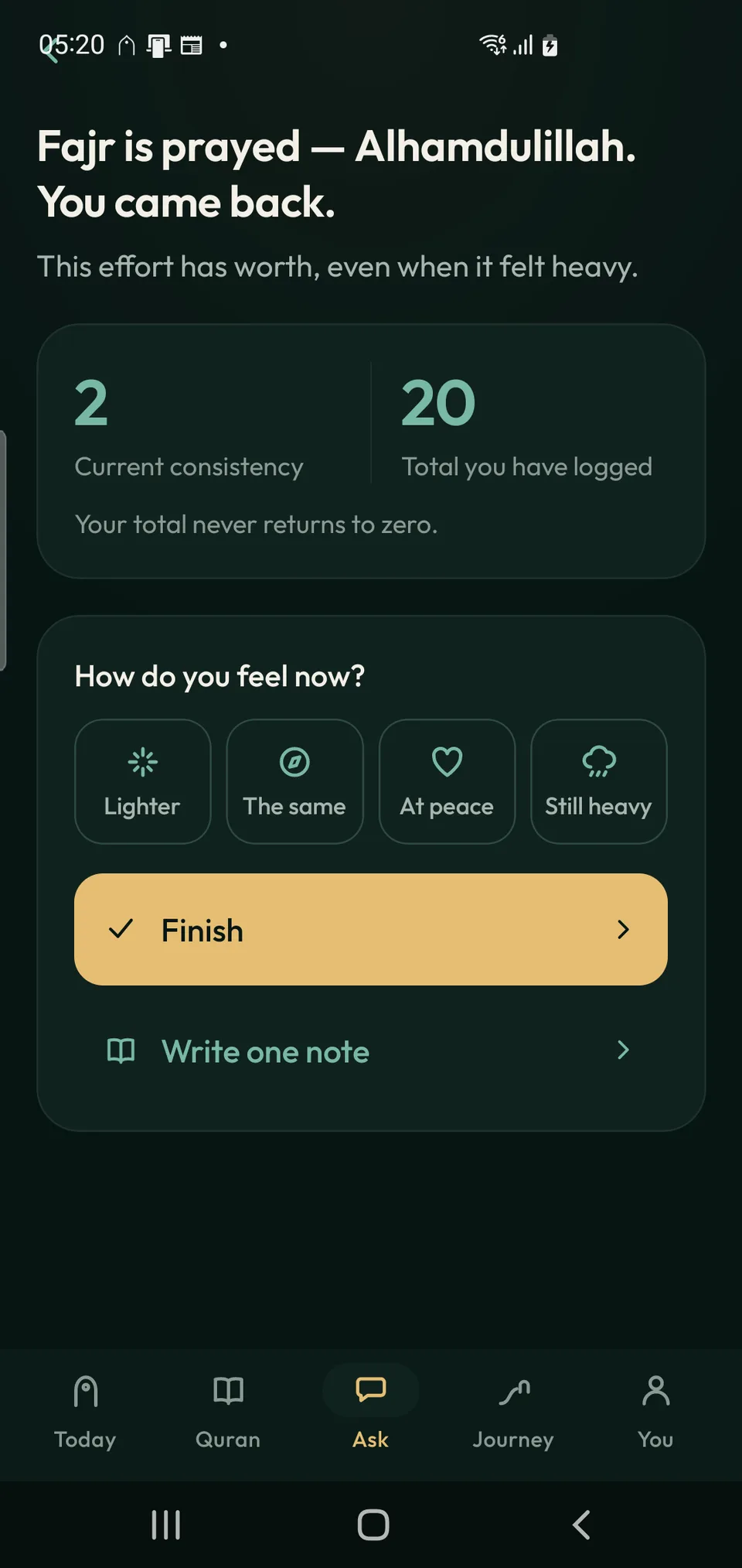
The after-prayer screen acknowledges completion, then offers a brief feelings check-in and an optional note. It displays current consistency separately from the total number logged. The total is presented as something retained, rather than erased by a break in the routine.
That separation is an interface choice worth examining. A running total can recognise earlier effort while a current measure describes the present. It does not prove that the design changes behaviour; it gives the next round of product testing a concrete question to explore.
What this project can show a client
Ma’ab brings together screen hierarchy, interface writing, visual identity and a connected journey. The screenshots show how those elements can support one purpose instead of competing for attention. They are current development previews, and the experience may change before release.
For a new app, the same process starts by choosing one important journey and defining the screens around it. A prototype then becomes something a client and potential users can discuss in detail: the labels, the choices, the information and what happens next.
Connect the product experience with a clear brand identity ↗
Common questions
Is Ma’ab available to download?
Not yet. It is in development, and these are screenshots of the current app experience.
Are the numbers in the screenshots user results?
No. They are interface values shown in the development screenshots, not evidence of adoption or measured outcomes.